
Bias in Board Games
Board games may seem like innocent pastimes, but beneath the cardboard and plastic lie deep-seated assumptions about fairness, power, and access. From Monopoly’s capitalist fantasy to Risk’s colonial conquest narrative, games often mirror - and reinforce - real-world systems of dominance. Yahtzee is not alone in its flawed framework; it’s part of a much larger tapestry of play that subtly shapes our worldview.
Editor's note: The editors of The Yahtzee Blog allot a semi-regular column, “Loaded Dice”, to a junior intern at the World Yahtzee Institute writing under the pen name "Y". Like a growing number of people around the world, Y subscribes to a mind-boggling array of alternative facts and conspiracy theories. But in the interest of equal time their thoughts are presented below. The following commentary does not represent the views or opinions of the World Yahtzee Institute or its subsidiaries.
Consider the global hit Monopoly: a game originally intended as a critique of landlord capitalism, now used as a celebration of it. Or Risk, which rewards players for imperial expansion across arbitrarily divided continents. Even classics like Clue (or Cluedo) present a suspiciously narrow view of social class and domestic roles. These games, often designed decades ago, reflect the biases of their time - biases that still linger unchallenged today.
As the World Yahtzee Institute reimagines the scorecard, scholars and designers around the world are asking broader questions: What would a truly inclusive board game look like? What stories have we left off the board? Can we rethink rules, mechanics, and objectives to reflect a wider, more just reality?
Bias in games isn't just about winning or losing - it's about the narratives we internalize. Who gets to move first? Who controls the board? Who gets left behind in the box?
Unpacking Bias on the Game Board
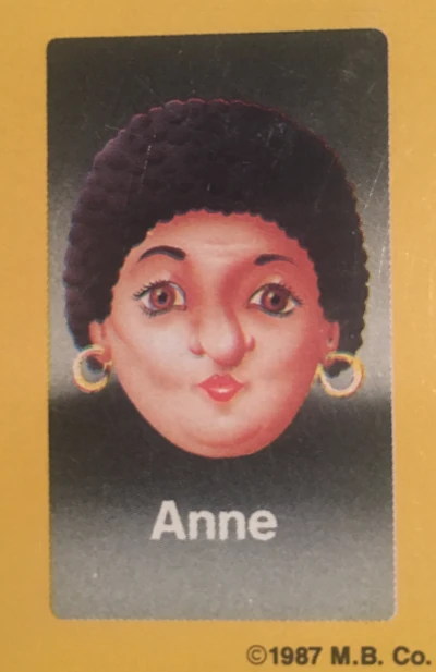
in Guess Who?
Bias in board games often hides in plain sight. It can be baked into mechanics, baked into the artwork, or baked into assumptions about who is playing and how. Games are, after all, systems—tiny models of reality—and like any system, they can privilege certain players while excluding others.
For instance, many classic games default to Western-centric worldviews, erasing entire continents or reducing diverse cultures to stereotypes. Some strategy games treat entire nations as resources to be collected or conquered. Even the color of game pieces can carry loaded implications—why is black always the villain? Why is white the standard for the “default” player?
These subtle choices aren’t always malicious, but their impact is real. They shape how players interpret fairness, power, and identity—even if only subconsciously. By examining them more closely, we can begin to rewrite the rules of play.
- Monopoly: Though it began as a teaching tool to illustrate the dangers of concentrated land ownership, Monopoly has morphed into a celebration of capitalism’s harshest instincts. The game rewards ruthless acquisition, punishes poverty, and often ends in one player crushing the rest. It reinforces the notion that economic dominance is the ultimate goal, no matter the cost to others.
- Risk: With its global map and conquest objectives, Risk gamifies imperialism. Players are encouraged to “take over” continents without context or consequence, treating entire populations as strategic tokens. Its simplicity masks a worldview where power is measured solely by expansion and domination, echoing centuries of colonial logic.
- Settlers of Catan: This modern classic presents players as pioneers “settling” untouched lands, despite the game’s eerie lack of indigenous presence. Resources are extracted, land is claimed, and expansion is glorified—all without any recognition of the historical and ethical weight of colonization. It's a silent, smiling erasure of real-world complexity.
- Clue: The game’s Victorian mansion setting subtly reinforces a class hierarchy. The domestic staff—Mr. Green, Mrs. White—are often seen as the prime suspects, while wealthy guests like Professor Plum and Miss Scarlet enjoy an air of innocence. It’s a murder mystery, yes, but one that unintentionally echoes real-world suspicion of the working class.
- Guess Who?: With its simplistic character traits and heavily white, male-dominated lineup in early versions, Guess Who? turns a deduction game into a crash course in unconscious bias. When diversity is lacking, questions like “Is your person Black?” become disproportionately powerful, teaching kids that minorities are easy to single out—not exactly the lesson you want in a family game.
Yahtzee Score Card Bias
The Full House is the Greenland of the Yahtzee scorecard. They have both been misrepresented for centuries, resulting in a myriad of misconceptions and overinflations of their importance. Don’t get us wrong, Greenland is a wonderful place with a unique landscape and a proud people. But early attempts at European colonization saddled the land with a massive case of false advertising that survives to this day. The name “Greenland” isn’t a fair representation of the land as it is mostly covered by the second-largest ice sheet in the world. Rather, it was a marketing ploy designed to lure Viking settlers. The discrepancy between the verdant name and its large swaths of frozen tundra surely became immediately clear to those first enterprising settlers. But Greenland has long been distorted in another, more subtle way that isn’t obvious to most people.
In 1569 the gold-standard of world maps was created. The so-called Mercator projection displayed the entire globe as a flat surface with perfectly straight latitude and longitude lines. Its simplicity proved to be a boon for nautical cartography and it is still used as the template for almost all navigational maps. It also found success in educational maps and can be found on classroom walls the world over. The major problem with the Mercator projection is that it necessarily distorts regions of the globe, particularly the polar areas, in order to represent the spherical Earth as a flat surface. Alaska, for example, appears to be the same size as Australia although in reality it is 4.5 times smaller. China looks like it is twice as big as the contiguous United States, when they are in fact about the same size. And Greenland appears to be the same size as the whole of Africa when Africa is actually a whopping 14 times larger. While it is true that Greenland is the world’s largest island, its super-sized appearance on world maps has misled generations of schoolchildren into geographical delinquency.
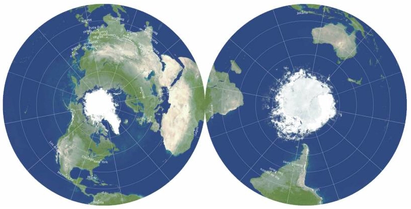
Now Princeton astrophysicists are righting the wrongs of the Mercator projection and have come up with the most accurate flat map ever made. Its creators first invented a system to quantify the six different types of distortions that flat maps can produce and then graded existing map types to determine how they could be improved. Their final product is a two-sided flat map that effectively eliminates all spatial distortions that can be introduced when flattening a sphere. It has the added benefit of centering each side of the map on the Earth’s poles which removes mapmaking’s political aspect of arbitrarily placing a given country or region at the center. And Greenland appears on the new map just as it should, not as a bloated monstrosity.
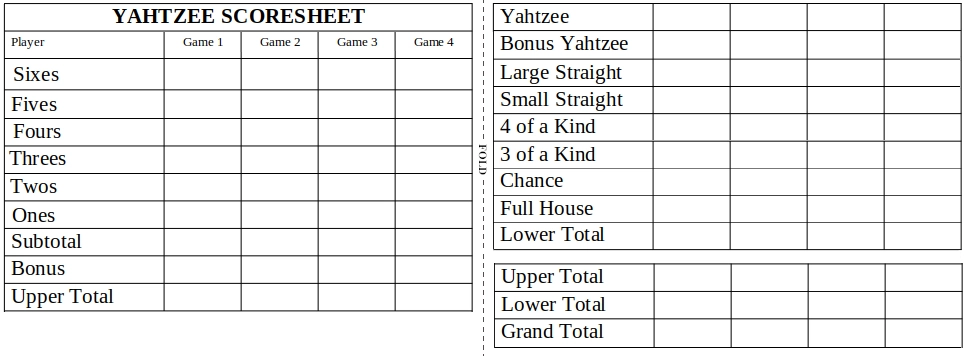
While a two-sided map may not be ideal for a classroom wall, it seems that all is well in the world of cartography as the menace of the Mercator projection has finally been subdued. Which brings us back to the Yahtzee scorecard. In the same way that old world maps misrepresent the true shape of landmasses and distances between them, the layout of a Yahtzee scorecard contains inherent biases that can mislead a player. The Yahtzee itself, for example, is the highest scoring category on the scoresheet but is traditionally located near the very bottom of the card. Because the player’s eye is naturally drawn to the uppermost categories first, this placement serves to undermine the importance of the Yahtzee. The Full House, meanwhile, is often considered to be the easiest category in the Lower Section aside from Chance. The popular mantra “Let the Full House come to you” serves as a reminder that a player is likely to roll many of them during a game and that it therefore needn’t become the center of attention. Yet it continues to occupy prime real estate on the Yahtzee scorecard at the upper reaches of the Lower Section. Inexperienced players who don’t know any better may be unwittingly drawn to the Full House due to its arbitrary location on the scoresheet. Much like Greenland, it has been granted an outsized importance as a result of an underlying bias in design.
Taking inspiration from the new two-sided world map, researchers at the World Yahtzee Institute have created a scoresheet that realigns the scoring categories in a more logical manner. Biases and arbitrary misrepresentations have been removed to the extent that is possible to create a more fair and just Yahtzee scorecard. Like its cartographical cousin, the scorecard is two-sided. This confers a sense of equality to the Upper and Lower Sections, which keep their conventional names but can be thought of as the “front” and “back” sections. Scoring categories have been reordered according to their statistical importance. And the Full House takes its rightful place at the bottom of the Lower Section where it belongs.
Don’t let yourself be chained in by the inherent constrictions of the traditional Yahtzee score card. If you feel the urge to correct inherent biases or just as a means of personal expression, homemade scorecards offer a level of freedom unobtainable from the standard set.
